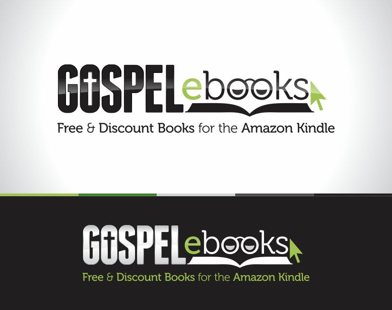
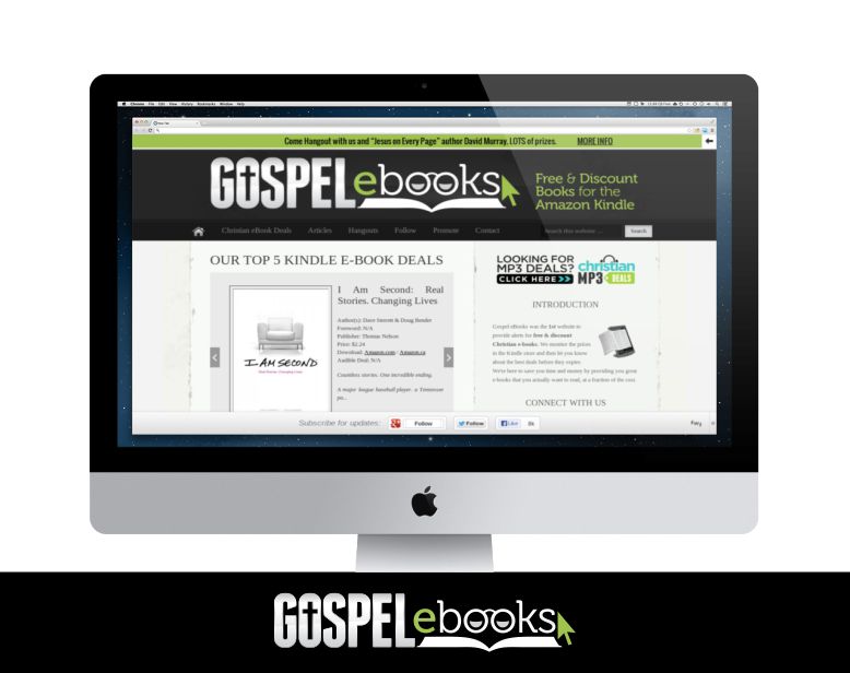
This project was created to help communicate their website for discount Kindle eBooks. The client loved the idea of words having a double meaning to them.
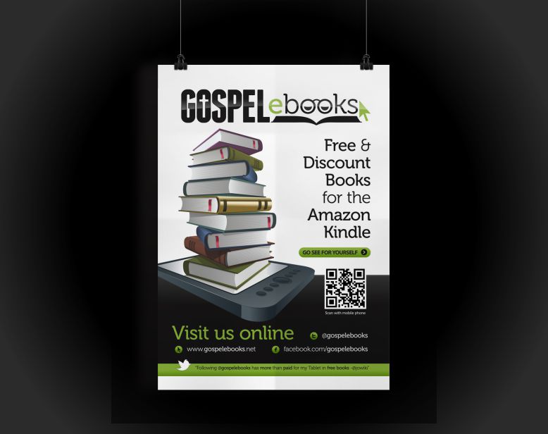
I spent some significant time trying a few different ideas, but then thought that we could use the letter “o’s” to display eyes/glasses of someone who is reading. They feel in love immediately and the rest was tweaked to work and fit well within their existing website. I ended up making posters, business cards and web ads for them as well.
- Branding
- Print Design

