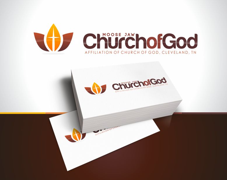
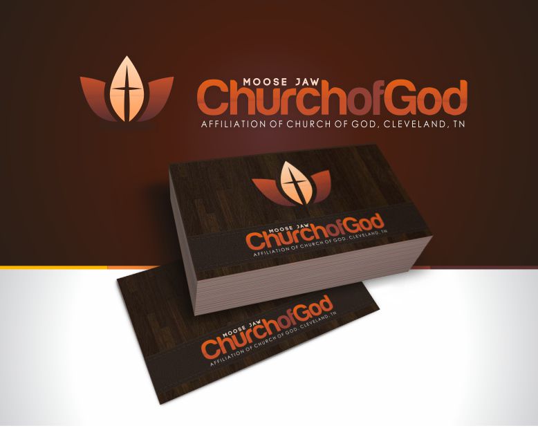
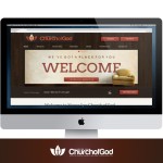
A church re-branding project designed to breathe new life into their identity from their generic design. The challenge here was to communicate the values of their church, while also complementing their target demographic for the community.
After pursuing numerous different ideas, I settled into creating an identity that would properly communicate growth, cross centred and the warmth of a friendly welcoming church. I used an abstract leaf to inspire growth and life, while adding a thin cross in the centre. In addition to this, I specifically choose colours that feel inviting and safe. They loved the design so much, that they changed signage on the church.
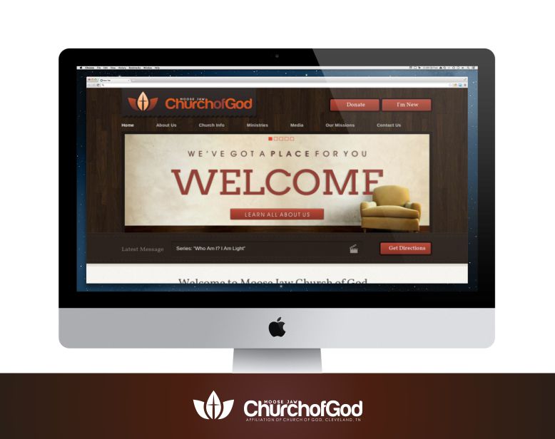
I continued their branding throughout the website and print material.
- Branding
- Print Design
- Web Design

