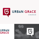
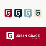
Urban Grace Church is an established church plant that needed a redesign of their logo to match where they have come from and where they are moving towards. They wanted an identity that would uniquely communicate them and that would be equally scalable and not limited to one geographic location.
I created the logo with three major elements in mind; speech bubble, the combincation of the letters GU and the subtle hint of the number 5. The speech bubble is to communicate the clear preaching of the Bible, as well as the value of community and relationship that the church has. The monogram within the logo of the letters “U” and “G” was for obvious reason. The letter “U” is less focused on as it is in shown in the very middle of the logo. Finally, the number five was inspiration, as it refers to grace in the Bible. I wanted to add a complexity to the logo, but yet keep it iconic in its approach. In the end, the client was very pleased and absolutely proud of their new identity.
- Branding
- Identity Design

