A church re-branding project designed to modernize their existing identity. The challenge here was to preserve the elegance of their name contextualizing it to the average demographic of young families.
I felt the best way to marry these concepts together was with a regal feel that displayed their logo as a family crest or banner from medieval times. This flavour helped incorporate the word “Kings” easily into the brand. In addition to this, I gave the crown above the “K & C” a colour separation to hint towards the word “Corner” in their name. Inside the banner the letter “K” also spells the letter “C” for that double take that makes a logo last. Overall, I am please with this epic logo that depicts the church in a variety of ways.
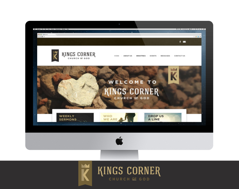
I continued their branding throughout the website, to add the contrast between regal and community. The website was a great way to finish off this royal win.
- Branding
- Identity Design
- Web Design