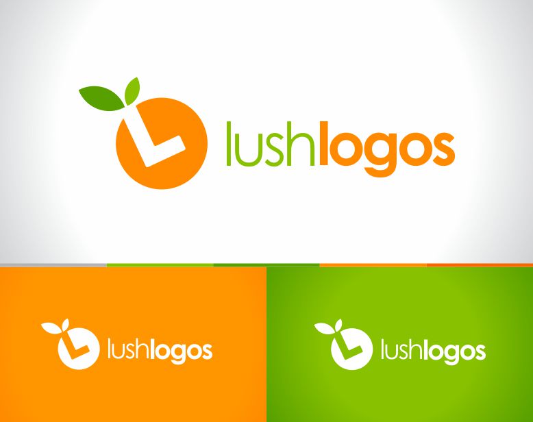
I created this design for a stock logo website where you can purchase template logos for quick use. The design was inspired by grocery store shelves. I had the idea of seeing multiple stock logos sitting on shelves that would be branded by different types of fruit. I simplified the idea and focused on the labels/stickers you see on pieces of fruit. I thought that would make a rad looking logo to help describe the word “Lush.”
The end product was an orange with a negative space letter “L” placed inside for simplicity, creating an iconic and memorable design.
- Branding
- Identity Design


